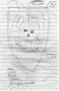
I’m not kidding when I say that either. As an author, I’m totally, 100% reliant upon the artists I commission for my books to create images that will catch people’s eyes. Often, I’ll have a picture in my mind, and will try to communicate that to the artist using my own drawing skills and text. An example of the draft that my artist Marc Ducrow had to work from is below.
Yes, this is truly amazing. Buy my fucking book!
As you can see, I had an amazing concept piece from which he could take inspiration and work. I also provided a Pinterest board of skulls. This included artistic skulls as well as skulls used historically on unit badges ranging through a number of wars over hundreds of years.
I also realised that my garbled instructions at DevCon in Plymouth might now have been as clear as I remembered them being so I wrote them out for him and sent them over.
This morning, I received the following image;

Somehow he was able to work out what I wanted.
This was a lovely thing to get at 07:30 this morning and I have to admit to giving a little squeak of excitement. But … I then started to look at it, and think about my plans for making these into actually embroidered badges (maybe even polo/t-shirts) and came to the conclusion that I still wasn’t 100% happy with it. It was close, but it was missing the X-Factor that I felt would really leap out at to the buyer.
So I did some searching and came up with a scroll that I liked. Then I had a think about the font being used on the banner. It wasn’t going to translate well to embroidery, nor was it going to be easy for people to read. I did another quick search to see what sort of font existing units used and had Marc change that and make the skull a tad bigger as well.

The final image. With which I’m very pleased indeed.
The long-suffering Marc then sent me this image. It was exactly what I wanted, designed in such a way that I could use it on any number of backgrounds as I published my books.
A book is judged by its cover, no matter what people say. If it has a good cover that is eye-catching and has obviously had talent and skill put into its creation, then people are going to consider buying a book, which is a big step forward. If the cover is poorly drawn, badly laid out, and has 5 different fonts, then it doesn’t matter if the story inside has life-changing and award-winning prose, it’s just going to be passed on by.
If you’re considering self-publishing your own book, consider this one sobering fact. The average self-published book sells 250 copies in its lifetime. 250. If your cover isn’t well-designed, that 250 might take your lifetime to achieve. Maybe, just maybe, with a cover that has been well-designed, you’ll make the 250 in the first year, month, week, or even day and continue to do so!

Discussion
No comments yet.